In the last post, we covered the fundamental principles that supported PivotTables, and reached the stage at which the frame of the PivotTable was built.
This post will introduce you to the analysis itself.
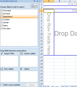
So now, we have the wireframe of a PivotTable.

There are four sections within a PivotTable. Each can house one or more fields. And to get the fields into those sections, you either drag them into the four boxes directly below the field list; or you drag them into the table itself. Each way yields the same result.
Page fields (or Report filters)
These are filters that are applied at the field level. You use this feature if you want your PivotTable to only look at a subset of rows in your source data: a specific geography; women; high-priority risks. You can drag multiple fields into this area, allowing you to, say, only analyse males in the US.
Column fields/labels
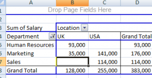
These will contain the fields whose values you want to see in the columns. If you want each column to show a different country, drag the "country" field into this section. And if you want to see cities within each country, then drag both fields into that section. The top-most field will form the first grouping, and so on.
Once selected, a dropdown box will appear next to the column title in the table itself. This can be used to sub-select those values that you want to appear. You may, for example, not want to report data for the US.
Row fields/labels
These will contain the fields whose values you want to see in the rows. If you want each row to show a different gender, drag the "gender" field into this section. And if you want to also group your data by age, drag both fields into that section. Again, the top-most field will form the first grouping, and so on.
As with the columns, a dropdown box will appear next to the row title in the table, which can be used to sub-select those values that you want to appear.
Data/values
Here's the bit that quite a few people find a bit odd: the data itself. It's also the crux of the puzzle.
If you've defined your filters and row and column headings, the frame of your table looks good, but without populating data/values. So here's how they work.
If you simply want to count records, then choose any field that's populated across all records (a unique reference number or gender, for example). If it's a text field, then the PivotTable will have no option but to count. (Have you ever tried to sum a bunch of countries?)
Intuitively (to me at least), it would make more sense if PivotTables defaulted to give a count of the records. But in the absence of this, you're forced to choose a field, then contents of which are counted. Note: it only counts rows that contain something in the column selected. So if you want to count every row, choose something that's populated exhaustively. So if you have a record with a missing gender and choose gender as your data/values field, that record will not be counted.
If instead you choose a field that's formatted as a numeric, then Excel will decide that you're probably looking to sum the data. So, for example, if you drag the Revenue column into the core of the table, it will show the total (sum of) revenue by geography (if geography is in the column labels).

If you want to report on multiple fields, the core of the table can accommodate multiple fields. You may, for example, want to report both revenue and profit for each intersection of rows and columns.
If sums are not sufficient for you, then hit the down arrow next to the field name in the tray in which it appears below the PivotTables field list. Hit Value Field Settings. A list of other functions appears for selection on the Summarize by tab, the most useful being Max, Min and Average.
That same dialog box contains additional options on the Show values as tab. The dropdown at the top allows you to change the way in which your data appears. So instead of showing values you can, for example, show the percentage of the row or column that the value represents. It's worth having a play in this area once you're confident in the more common functionality.
If you have any questions, please get in touch. PivotTables are quite daunting, but once you become comfortable using them, they unleash such power.

 Trouble with formulae? Lookups not going so well? The Wizard of Excel can help. Dan Harrison offers practical tips and examples, as well as Excel training and consulting.