
Facebook vs. Television infographic
Visit: http://visual.ly/facebook-vs-television
Click for larger version (ideal for cut+paste into presentations!)
An infographic is a useful way to get across really complex information. This one helps set the scene for Facebook and the stats that have driven it to be the world’s largest digital platform.
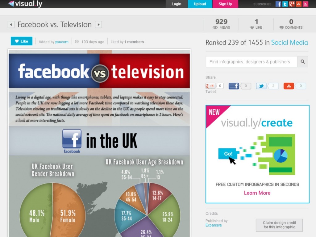
Living in a digital age with things like smart phones, tablets and laptops makes it easy to stay connected. People in the UK are now logging a lot more Facebook time compared to watching television these days.
The national average time spent on Facebook on a smart phone is two hours.
Follow @DigEngGuide for more examples and tips
 Everything