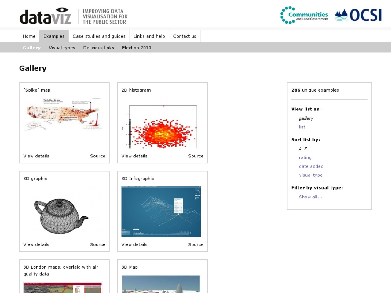
Improving visualisation: infographics and more
Visit: http://www.improving-visualisation.org/visuals
The Improving Data Visualisation site from OCSI (supported by CLG) is a great resource of tools, examples and ideas for creative uses of graphing, mapping and other data visualisations to tell stories with data. It’s also worth reading a great blog post on top tips when commissioning data visualisations by Gillian Hudson of Number 10’s Digital team.
Good data visualisation can help users explore and understand the patterns and trends in data, and also communicate that understanding to others to help them make robust decisions based on the data being presented. This site supports public sector researchers improve the way that they visualise data, by providing good practice examples and case studies, practical and step-by-step guides on how to visualise data, and links to more detailed resources.
Follow @DigEngGuide for more examples and tips


 Everything